I wanted to render as simple ancestry chart as a navigation interface for another project. This was a lot more challenging than I anticipated. Maybe sharing this can help someone else with similar projects.
First, a quick look at the result. It’s low-resolution in an attempt to hide some of the detail information.
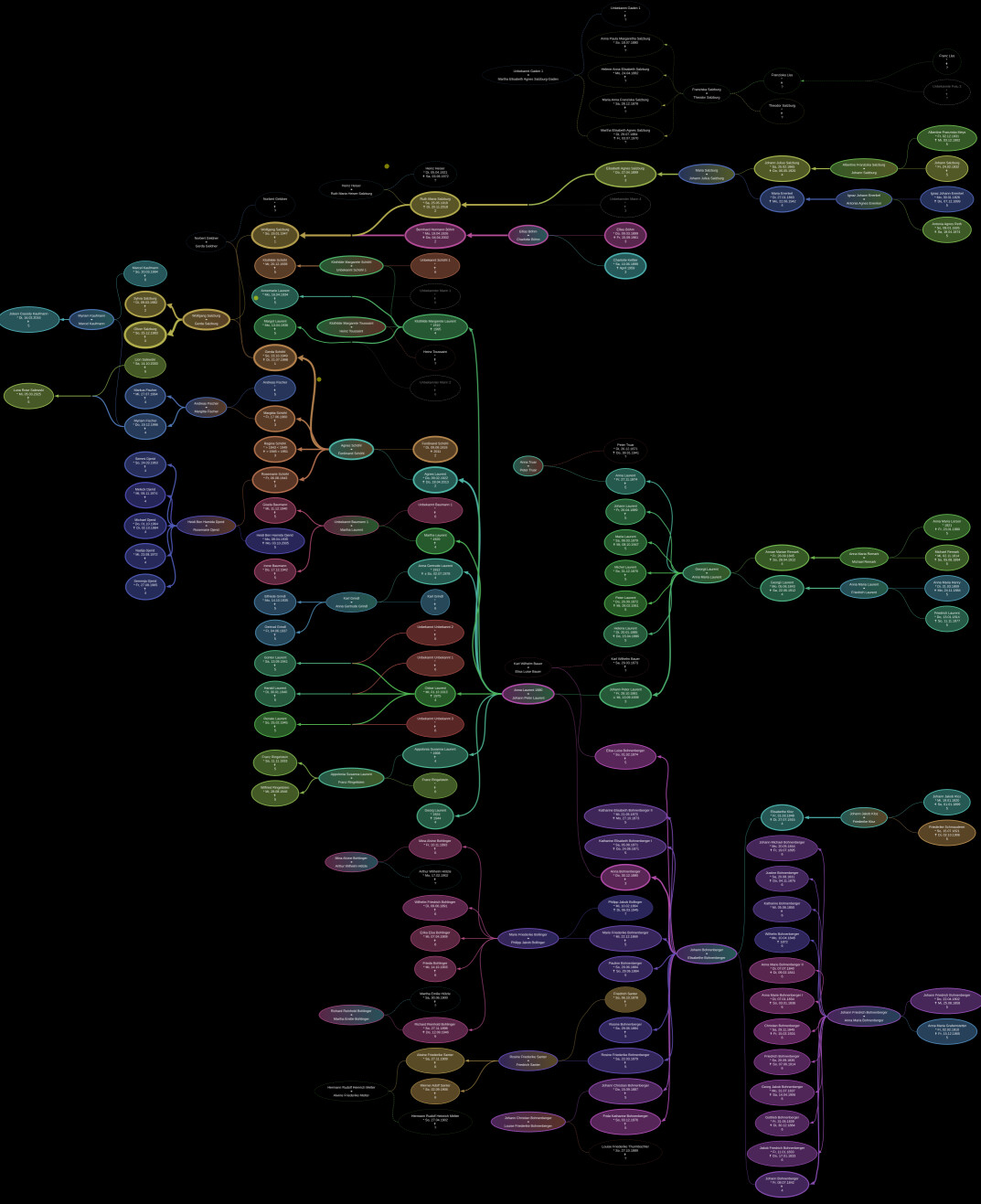
Authoring the graph by hand quickly became impossible, so it is generated from an identity relation graph constructed from my proprietary data set, which has similarities with GEDCOM.
My most important learnings so far:
-
Constructing unknown male and female identities for missing father/mother personas in the graph, makes the solution a lot more uniform.
-
Using “joiner nodes” to represent marriages and/or DNA mixing uniformly, helps representing offspring during and outside of marriages uniformly as well. This also helps a lot with assigning offspring or their respective origins, in cases of varying spouses assigned to offspring.
-
Every identity can have any number of aliases. The most common use of an alias is when an identity changes their name during marriage. Children pointing to an alias as a parent, clearly signal to be consummated within the marriage that created that alias. Although visualizing a potentially slightly out-of-marriage child is not really contributing anything to my desired result.
-
Coloring nodes/links is achieved by picking colors from the HSL color space. This is highly convenient, because the space has a circular layout, which we can divide into as many segments as we need, and then just assign the colors of those segments to our identities. Because the identities are laid out in the file system as
lastname-firstname.yml, they alphabetize into an order that keeps last names grouped. When now assigning the colors from the color wheel in order to those identities, those related to each other (by name) are also colored similarly. This works until you reach levels with multiple tribes of unrelated people that share the same last name. I’m not there yet, but I think file system folders might work well enough to add another level. -
Styling beyond color is deduced from the ancestry rank of the identity for a given origin identity. Most noticeably, lines get thicker if the blood relation is stronger.
This entire graph was really only supposed to be a navigation “mini map” for my other project. For every one of those people, the data set contains not only their identity, but any life event whatsoever. So the idea is that you can click on any of those identities, and then be sent into the “timeline universe” to see how their life went. Both solutions utilize the same coloring/styling framework to make identities properly recognizable.

I hope to report on the universe project at some point as well ![]()