Cleaning DOT graph (making it clearer)

Hello,

I have the following graph, my issue is with the edges and labels looking cluttered.
I have tried spacing the graph by adding graph [rankdir=LR nodesep=1.5 ranksep=1.5, splines=ortho, margin=10, esep=5]

This is what I want:
1. The space between the edges to be bigger
2. The labels to not be so close to each other
3. The edges not to go over the labels (as seen for B1 and B2)
4. The edges to go over other subgraphs as few times as possible (as seen for A2)

How can I achieve this ?

Thank you.

image

	digraph G {
	graph [rankdir=LR nodesep=1.5 ranksep=1.5, splines=ortho, margin=10, esep=5]	
	edge [fontsize=12]
	    subgraph "cluster_A1" {
	    "A3"[shape=rectangle, style="rounded,filled", fillcolor=khaki]
	    label = "A1"
	    style = "filled, rounded"
	    fillcolor = "lightgray"
	        subgraph "cluster_A2" {
	        label = "A2"
	        style = "filled, rounded"
	        fillcolor = "lightblue"
	        "A4"[shape=rectangle, style="rounded,filled", fillcolor=khaki]
	        }
	    }
	    subgraph "cluster_B1" {
	    label = "B1"
	    style = "filled, rounded"
	    fillcolor = "lightgray"
	        subgraph "cluster_B2" {
	        label = "B2"
	        style = "filled, rounded"
	        fillcolor = "lightblue"
	        "B3"[shape=rectangle, style="rounded,filled", fillcolor=khaki]
	        "B4"[shape=rectangle, style="rounded,filled", fillcolor=khaki]
	        }
	    }
	    
	    A3->A4[xlabel="\E", style="solid"]
	    A3->B4[xlabel="\E", style="solid"]
	    A3->B4[xlabel="\E", style="solid"]
	    A3->B3[xlabel="\E", style="solid"]
	    A4->B4[xlabel="\E", style="solid"]
}

[Surprising challenging. Ortho is buggy, but produced a nice result this time - after lots of false starts.]
Lots of tweaks,

  • to help ortho do its thing, minlen=2 to slide A4 over
  • headlabels + taillabels,
  • very sensitive to ranksep
  • enlarged node size to help edge positioning
  • constraint=false on one edge to reposition lower cluster
  • added spaces to label text to adjust right/left
digraph G {
  graph [
    rankdir=LR
    //nodesep=1.5
    ranksep=1.2    // magically, tweaking ranksep changed A4->B$, yea!!
    //ranksep=1.0  // magic is ALL gone, boo
    splines=ortho,   // ortho is buggy, but seems to do best

    // margin=10 // in inches!!!, not helping,
    // esep=5    // neato only, ignored by dot
  ]
  edge [fontsize=12]
  node [width=".9"  height=".8"]  // bigger nodes for spread-out edge connection

  subgraph "cluster_A1" {
    label = "A1"
    style = "filled, rounded"
    subgraph "cluster_A3i" {  // get A3 & A4 vertically aligned
      peripheries=0
      label=""
      "A3"[shape=rectangle, style="rounded,filled", fillcolor=khaki]
    }
    fillcolor = "lightgray"
    subgraph "cluster_A2" {
      label = "A2"
      style = "filled, rounded"
      fillcolor = "lightblue"
      "A4"[shape=rectangle, style="rounded,filled", fillcolor=khaki]
    }
  }
  subgraph "cluster_B1" {
    label = "B1"
    style = "filled, rounded"
    fillcolor = "lightgray"
    subgraph "cluster_B2" {
      label = "B2"
      style = "filled, rounded"
      fillcolor = "lightblue"
      "B3"[shape=rectangle, style="rounded,filled", fillcolor=khaki group=G]
      "B4"[shape=rectangle, style="rounded,filled", fillcolor=khaki]
      {rank=same B3->B4 [style=invis]}
    }
  }

  // add spaces to labels to shift left or right
  // change xlabels to headlabels or taillabels for "better" placement
  A3->A4[xlabel="\E", style="solid"  minlen=2]
  A3->B4[headlabel="\E       ", style="solid"]
  A3->B4[headlabel="\E       ", style="solid"]
  A3->B3[headlabel="\E       ", style="solid"]
  A4->B4[headlabel="        \E", style="solid"  constraint=false] // help center B1
}

Giving:

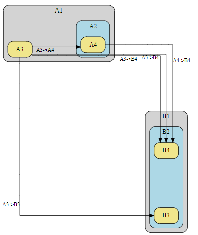
Thank you for your answer, it looks good !

Sorry, I should have mentioned that my diagrams will be generated automatically depending on some values, and the output is larger than the example provided below.
So I don’t know what the graphs will look like and these changes don’t seem to solve my issue.

Is there a way to:

  • create a margin between the labels and other edges
  • prevent edges from being so close
  • optimize where the arrow tail is starting from
    (ex. A9->B1_invis is too close to A9->B10, I would like it to start from the left side of A9)
  • putting the lables inside the arrow like this:
    image

So I’m just looking for changes to make very large diagrams clearer when I don’t know the output in advance.

Thank you !

larger graph img

code
digraph G {
  graph [
    rankdir=LR
    // nodesep=1.5
    ranksep=1.8    // magically, tweaking ranksep changed A4->B$, yea!!
    //ranksep=1.0  // magic is ALL gone, boo
    splines=ortho,   // ortho is buggy, but seems to do best
  ]
  edge [fontsize=12]
  node [width=".9"  height=".8"]  // bigger nodes for spread-out edge connection
  
  edge [fontsize=12]    
  
    subgraph "cluster_A1" {
      subgraph clusterI1{
        peripheries=0 // no surrounding box
        margin=0      // reduce vertical space 
        "A1_invis"[shape=point style=invis ]  // pin ignored by dot  pin=true]
      }
      "A3"[shape=rectangle, style="rounded,filled", fillcolor=khaki]
      label = "A1"
      style = "filled, rounded"
      fillcolor = "lightgray"
        subgraph "cluster_A2" {
        label = "A2"
        style = "filled, rounded"
        fillcolor = "lightblue"
        "A4"[shape=rectangle, style="rounded,filled", fillcolor=khaki]
        }
    }
    subgraph "cluster_B1" {
    subgraph clusterI2{
      peripheries=0 // no surrounding box
      margin=0      // reduce vertical space 
      "B1_invis"[shape=point style=invis]  // ignored pin=true]
      }
    label = "B1"
    style = "filled, rounded"
    fillcolor = "lightgray"
        subgraph "cluster_B2" {
        label = "B2"
        style = "filled, rounded"
        fillcolor = "lightblue"
        "B3"[shape=rectangle, style="rounded,filled", fillcolor=khaki]
        "B4"[shape=rectangle, style="rounded,filled", fillcolor=khaki]
        }
    }
  
  subgraph "cluster_A5" {
    label = "A5";
    style = "filled, rounded";
    fillcolor = "lightblue";
    "A9"[shape=rectangle, style="rounded,filled", fillcolor=khaki];
    "A10"[shape=rectangle, style="rounded,filled", fillcolor=khaki];
  }
  
  subgraph "cluster_B5" {
    label = "B5";
    style = "filled, rounded";
    fillcolor = "lightblue";
    "B9"[shape=rectangle, style="rounded,filled", fillcolor=khaki];
    "B10"[shape=rectangle, style="rounded,filled", fillcolor=khaki];
  }
  
  subgraph "cluster_A8" {
    label = "A8";
    style = "filled, rounded";
    fillcolor = "lightblue";
    "A15"[shape=rectangle, style="rounded,filled", fillcolor=khaki];
    "A16"[shape=rectangle, style="rounded,filled", fillcolor=khaki];
  }
  
  subgraph "cluster_B8" {
    label = "B8";
    style = "filled, rounded";
    fillcolor = "lightblue";
    "B15"[shape=rectangle, style="rounded,filled", fillcolor=khaki];
    "B16"[shape=rectangle, style="rounded,filled", fillcolor=khaki];
  }
  
  A3 -> B3 [taillabel="\E", minlen=2];
  A4 -> B4 [taillabel="\E", minlen=2];
  A4 -> B3 [taillabel="\E", minlen=2];
  A1_invis->B1_invis [taillabel="\E", style="solid"
      minlen=2  // push cluster_B1 to the right (down a rank)
      ltail=cluster_A1, lhead=cluster_B1 ]  
  A9 -> B1_invis [taillabel="\E", minlen=2, ltail=A9, lhead=cluster_B1 ];
  A9 -> B9 [taillabel="\E", minlen=2];
  A9 -> B10 [taillabel="\E", minlen=2];
  A10 -> B9 [taillabel="\E", minlen=2];
  A10 -> B10 [taillabel="\E", minlen=2];
  A15 -> B15 [taillabel="\E", minlen=2];
  A15 -> B16 [taillabel="\E", minlen=2];
  A16 -> B15 [taillabel="\E", minlen=2];
  A16 -> B16 [taillabel="\E", minlen=2];
  A16 -> B3 [taillabel="\E", minlen=2];
  A15 -> B3 [taillabel="\E", minlen=2];
  A10 -> A3 [taillabel="\E", minlen=2];
}

I think the default splines work well here. Makes the relationships more clear.

Edit in playground.

I would do away with the edge labels and explain using text below the image.

graph [compound=true] will fix the cluster-to-cluster edge