I think PNG format is not the best way to show this.
An interactive html format file , with expand/hide button, maybe the solution to get to know the large business process problems.
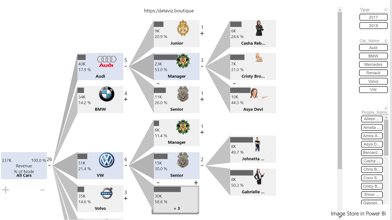
I would love to see an expand/hide. Here a few thoughts:
the Power BI example uses a tree where is it simple to see what can be hidden or expanded. But in a general graph with cycles, it isn’t as easy.
The number of combination of potential subtrees which are expanded or hidden leads quickly to a too big number of potential pre-layouted graphs, so a on-the-fly layouting would be needed.
For a tree a simple layout can be generated without even using Graphviz
For a generic graph that has cycles, WASM version of Graphviz could be used.
In a general graph it would make sense to do this on a set of nodes, hence on a cluster/subgraph. The subgraph would either:
collapse into a single node and all edges into the subgraph or coming out would be starting/ending at that node.
not shown at all (how to unhide?)
I assume that such an expand/hide would then require a new layout for the now newly “changed” graph. (->WASM)
Subgraphs could be created by a selection on the fly and don’t need to be pre-defined.
This power bi example uses hierarchy relation,which means you have certain level depth. Graphs always have uncertain levels.
Cycles in graph will be forbidden in such cases.