I am helping with the implementation of force directed graph layout using the stress majorization model in “neato”. The laid out distances respect the input distance data between nodes as closely as possible. The layout is supposed to be independent of rotational offsets, i.e., you can rotate the resulting layout by an arbitrary amount, and the laid out distances will still respect the input distances as closely as possible.
Does the presence of rectilinear grid lines on the layout distort the perception of proximity between nodes? Are there any citable sources about this?
I ask because of my nodding awareness of anchoring effects on subjective judgement: elicit judgement anchoring - Google Search
A quick google search doesn’t yield anything.
Interesting question. I don’t think there’s much research. You might think of this as providing evidence it’s not known to be an important issue. OpenAI chatbot claims gridlines can help with visual organization, and the drawbacks are potential clutter and bias. For “bias” it means that poor choices of gridline intervals could lead to “biased interpretations.” I don’t really see how reasonable, regular grid intervals could do that.
The possible biases that I can speculate on are that nodes on the same longitude or latitude may be perceived as having a different distance than those that are not. Or that nodes within the same grid cell might be considered more closely clustered than if they straddled grid lines. Maybe even the opposite effect, a grid line between two nodes interferes with the perception of white space between them.
Perhaps the best advice might be to view the resulting constellation of nodes with and without grid lines. If an analyst feels that the perception of proximities and/or clustering is affected, then go without the grid lines. I’m not sure what benefit grid lines offer such a graph because you’re not really trying to organize the nodes, but rather, to sense patterns. Trying to organize the nodes sounds like it might manifest as trying to impose subjective/preconceived patterns onto the graph.
That was my suspicion, but as you say, there doesn’t seem to be any investigation into this. It could mean that it isn’t a concern, but it could also be that such a use of graphs isn’t all that common, thus not attracting critical attention. For example, many graph layout packages of years past aren’t concerned with having layout distances reflect a ratio-valued metric between nodes, e.g., they driven by the binary absence/presence of edges to reveal patterns. Even among force-directed layout schemes, the velocity integration alternative differs from Kamada-Kawai / stress majorization in that it doesn’t try to layout internode distances to minimize distortion of the ideal input distance data.
Thank you for that comment. This was a good reminder about the previous work on graph drawing aesthetics and their impact on perception. Helen Purchase was an outstanding pioneer in this field. One useful reference is Ware, Purchase, McGill, Cognitive Measurements of Graph Aesthetics from IVS 1:2. https://journals.sagepub.com/doi/10.1057/palgrave.ivs.9500013 which mentions that “continuity” in reading edges affects our perception of shortest paths. More generally, Jacques Bertin includes alignment or orientation as one of the primary ways of encoding relationships. Tamara Munzner is a more modern reference - I don’t have her book (Visualization Analysis and Design) with me here but in some talk slides she mentions the benefit of alignment on enabling comparisons. I realize your question is about explicit grid lines but they just make the alignment even more salient,.
Thank you, Stephen. Yes, grid lines may emphasize some relationship edges while de-emphasizing others, depending on their alignment.
I just realized that there are other complicating variables. For example, the layouts with grid lines don’t have explicit edges, relying on perception of distance as cue for recognizing clusters and similarities. This is why I mentioned “white space” in my last response, forgetting to mention that the context is a constellation without edges [1].
As for orientation, the useful information in Kamada-Kawai and stress majorization layouts are inter-node distances only. The optimized layout can have any rotational orientation. Different orientations, however, might affect perception of proximities and clustering due to alignment of different edges (explicitly shown or not) with the x or y-axes. My concern is that grid lines amplify this, as suggested by your closing sentence.
Thank you again for the reference.
Notes
[1] In the most general graph situations, edges convey information about the existence of a relationship. If a node represents an entity, however, and the edge distances are calculated from a full matrix of correlations between all entities, then every node pair has an edge. Explicitly drawing edges on a layout, therefore, conveys no information compared to leaving them out. It may clutter the constellation and interfere with the recognition of clusters/proximity. I don’t have a citation for this; it just seems self-evident.
FYI, graphviz kamada-kawai is essentially multidimensional scaling and relies on computing all-pairs-shortest-path distance first. Graphviz stress majorization also does this by default. However there have been experiments with other distance models (like jaccard distance based on counting triangles, or higher order relationships, also by electrical circuit resistance distance) and they can help to untangle graphs with nodes of high degree where the shortest path model doesn’t make enough space around them.
Just in case it is useful to anyone:
-
There is a gvpr program named rotate in the source (cmd/gvpr/lib/rotate) that says:
Given node name and angle, rotate a layout using the given node as origin.
This is how it works:
dot -Tdot myfile.gv | gvpr -a "mynode 1" -cf rotate |neato -n2 -Tpng >myfile.png
-
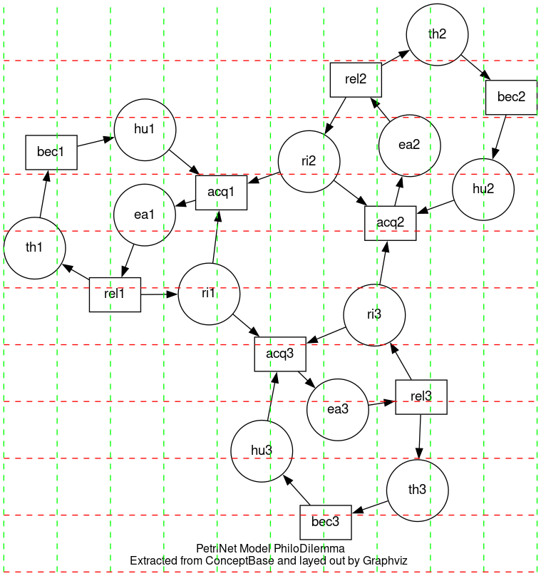
With a bit of work, gvpr can also be used to add gridlines to any Graphviz graph, again as a post processor. Here are three examples:

@scnorth: Thanks for that reminder, Stephen. I recall now that Kamada-Kawai (and hence stress majorization) bases the resting spring length on the shortest path. I’m a bit foggier on stress majorization, as it might do something else at a theoretical level, but the effect is similar. From my perusal of the papers some time ago, stress majorization can lay out the graph in more than 2D, whereas Kamada-Kawai is formulated for a 2D layout (vague recollection only!)
To visualize clustering and similarity, I would actually prefer that the resting spring distance not use the shortest path through the graph, but rather, the edge length between the two nodes. But I’m using what I can find.
@ steveroush: Thanks, Steve. I’m actually not a fan of having grid lines on a force-directed graph. Grids are great where the x- and y-axes mean something, but they don’t for force-directed graphs.
But it’s good to know that there are rotation commands and post-processing commands to add the grid for other situations.
I can’t recall exactly, but I may have nuked my Cygwin Linux work-alike environment on Windows, and GraphViz got nuked along with it. My current installation doesn’t include GraphViz, but I will re-install it in my next Cygwin update.
I thought the idea was to use grids to help measure distances.
If this is important, someone could make a cool interactive in, say, D3-graphviz, maybe with rollovers to show distances in some way, by showing concentric circles to mark distances from a focus node, or by creating overlays with labels to show graph-theoretic distances in the layout. Seems like a potential summer intern warmup project.
Grids could help gauge numerical distance, more so if two nodes are aligned in longitude or latitude. I was thinking of a graph layout as revealing larger scale patterns rather than quantitative distances (which are tabulated and available before layout).
Gosh, it just occurred to me that all my last response did was describe the general idea behind visualization. That is, the numerical data is used to create the visualization, but thereafter, the intuitive sense derived from the visualization is used to inform the analyst or decision maker. Too bad the time window to edit that last message is past, I could have simply revised it.
Anyway, that’s why I’m not too worried about the use of the grid lines to extract quantitative distances, as that would be moving backward in the visualization process. Instead, I’m more worried about how they impact the intuitive perception of the visualization product.
Well, yeah, I’m fairly sure that people perceive horizontal and vertical alignment as signifying a stronger a relationship than other angles. We might be able to find a reference. But how can we use this information in graph layout?
Also, not sure what bearing it has here, but some people like rectilinear layouts that favor node alignment, and where edges are routing using horizontal and vertical line segments. For one thing, all edge crossings are at 90°, so maybe easier to read. But there’s probably more to it than that. We found examples where people spent days manually drawing large entity-relation diagrams or database schemata in this orthogonal/rectilinear style.
I think the difference with Kamada-Kawai and stress majorization layout is that the positions of the nodes relative to each other are not arbitrary. They respect the input data distances a much as possible. It is in this context that clustering and proximity are meaningful. As much as possible, the perception of clustering and proximity should depend on this information irrespective of rotational offsets of the entire layout relative to the Cartesian axes